meta data for this page
This is an old revision of the document!
ANALYSIS AND APPLICATIONS EXAMPLES
Here are some examples we have come up with so far. Please email any of us on the project Greg Balco, Ben Laabs, and/or Joe Tulenko with your ideas so we can add them to the list!
1) Analysis layer examples: the ICE-D X OCTOPUS web application The ICE-D X OCTOPUS web application is not very much like the rest of the ICE-D focus area applications because it doesn't rely on an ICE-D-maintained back end database. Instead, its data layer is the OCTOPUS database of cosmogenic-nuclide data used for erosion rate estimates. Also, the web application accesses those data by interacting with a Geoserver web feature server rather than a MySQL database. However, it does use ICE-D middle layer applications (the web service implementation of the online erosion rate calculator), so it's a good example of an analysis-layer application that uses both data-layer and middle-layer services. Also, it highlights the idea that you can mix and match data- and middle-layer servives from various places to do what you need to do. Finally, it's a pretty simple web application with a fairly minimal amount of code.
The source code for the ICE-D X OCTOPUS web app can be viewed here. It is written in Python 2.7, uses the webapp2 application framework, and runs on Google App Engine. Unfortuately this is kind of obsolete because GAE has been migrating to Python 3 and different web app frameworks (so I am not sure if you could install and run it on a newly created GAE project), but it is a nice simple example of how a transparent-middle-layer application can work.
2) Data-model comparison between LGM and penultimate moraine ages, and model output from simulations over multiple glaciations (ie the ice sheet influence on regional climate example). Hypothesis: if the impact from ice sheets on re-arranging large-scale atmospheric circulation and thus modulating regional climate is actually significant, we should be able to use climate model output to predict the geospatial patterns of moraine preservation over multiple glacial cycles. This could be tested by comparing moraine ages and geospatial patterns from the database with model output to see where there is good fit between model output and data and where there isn't.
See the example output figure below and find a link to the tutorial here.
3) Testing global expression of Younger Dryas Please find a tutorial and some matlab scripts used to generate some of the plots found in a recent paper from Greg Balco (Balco, 2021) in this example.
Tutorial here.
Matlab scripts here in this zipped folder.
4) Post-Glacial Greenland ice-sheet retreat time-distance diagram following up on a workshop at the University at Buffalo, we attempted to generate a time-distance diagram of SW Greenland Ice Sheet retreat and you can find the matlab script here.
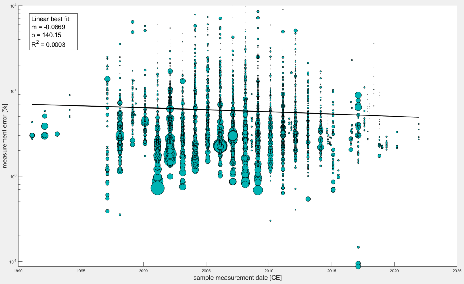
5) Determining if measurement precision has gotten better through time This is a somewhat simple and fun exercise to investigate whether or not we as a community have been making progressively better measurements (ie improvements to field sample techniques, lab extraction procedures, AMS measurements, etc that should hopefully be leading to more precise cosmo measurements).
See the summary plots below that show the story is a bit more complicated; essentially one must remove the effect of sample concentration on sample percent error.
Plot One This is what you get when you plot measurement errors (%) for all samples in the database (with sample collection dates) against their sample collection dates. There is a linear trend fitted to the data with a very poor R^2 value.
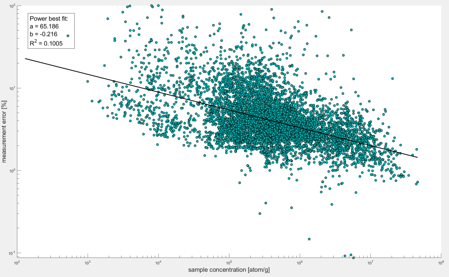
Plot 2 As it should be obvious from the plot, there is a notable power relationship between sample concentration and percent error. This should make sense because the higher the concentration of Be-10 in the sample, the smaller % of that is from background Be-10 (ie Be-10 that was not originally trapped within sample quartz grains but was rather either from meteoric Be-10 that contaminated samples, Boron contamination that has the same atomic mass as Be-10, and/or Be-10 that came with the Be-9 carrier).
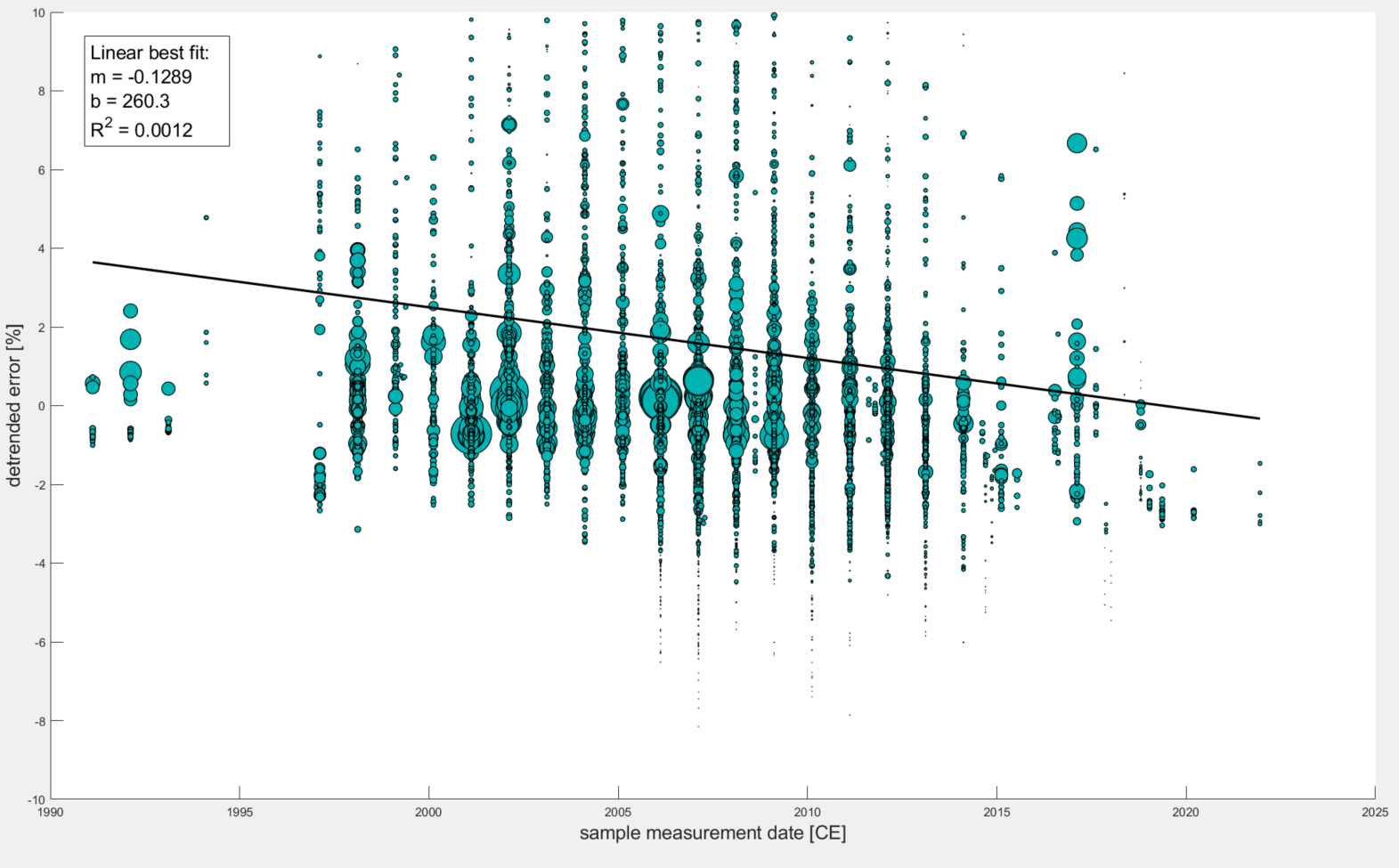
Plot 3 So what we need to do is detrend the data based on this power relationship. An easy way to do this is to simply calculate an expected value (based on the power relationship) and subtract that expected value from the observed measurement error. I could have made another plot to demonstrate this, but essentially if you plot detrended measurement errors against sample concentrations, the trendline you could fit to the data will be horizontal and centered at zero.
The final plot below shows what happens when you plot detrended measurement errors against sample collection date. Notice that the R^2 value is still relatively low but did increase by a factor of 4 and the slope became slightly more negative. Maybe this very loose correlation does say something about community improvement… What do you think?
and the code to make these plots is below:
%%%% A matlab script for extracting all samples from the database that have sample collection date info
%%%% and plotting their % measurement uncertainty against collection date
%%%% to see if we collectively as a community have gotten any better over the years
%%%% at making these measurements. Largest improvements I would expect
%%%% should come from laboratory procedures (ie lower level blanks, better
%%%% 10Be isolation techniques, AMS precision improvement (maybe), etc.

%clear out all pre-existing variables and windows to start fresh
clear all; close all;

% as always, one must first connect to ICE-D.
% Before running the script, be sure that you are connected to ICE-D in
% Heidi SQL!
% The script for connecting from a windows OS is as follows,
% assuming you set up an ODBC connection:

dbc = database('ICED-ALPINE','reader','beryllium-10');

% here is some code from Greg Balco for connecting to the database from a
% Mac computer. I have no idea if it actually works but here it is for
% y'all.

% Get Sequel Pro running and use
% the below to find the SSH tunnel port.

%[sys1,sys2] = system('ps aux | grep 3306');
%portindex = strfind(sys2,':173.194.241.211:');
%portstr = sys2((portindex(1)-5):(portindex(1)-1));


%%%%%%%%%%%%%%%%%%%%%%%%%%%%%%%%%%%%%%%%%%%%%%%%%%%%%%%%%%%%%%%%%%%%%%%%

% Once connected to ICE-D, we want to extract ALL samples from the database
% that have sample collection date information found in the 'samples' tab.
% here is an SQL query formatted in matlab to extract all samples and
% format the sample names, date collected, concentration of 10Be atoms and
% AMS measurement error into one table:

q1 = ['select samples.sample_name, samples.date_collected, Be10_Al26_quartz.N10_atoms_g, Be10_Al26_quartz.delN10_atoms_g, calculated_ages.t_LSDn ' ...
    ' from samples, Be10_Al26_quartz, calculated_ages ' ...
    ' where samples.sample_name = Be10_Al26_quartz.sample_name ' ...
    ' and samples.sample_name = calculated_ages.sample_name '...
    ' and samples.date_collected is not null '...
    ' and Be10_Al26_quartz.N10_atoms_g is not null '...
    ' and Be10_Al26_quartz.delN10_atoms_g is not null '...
    ' and samples.date_collected not like "0000-00-00" '...
    ' and samples.date_collected not like "0001-01-12" '];

% now, we want to store these selections as a table in matlab
% and convert the table into column vectors for plotting.
% this is made somewhat complicated by the fact that the dates extracted
% from ICE-D are in string format so you have to break them up.

samples.table = fetch(dbc,q1);
samples.date_cell = table2array(samples.table(:,2));
samples.date_cell_split = split(samples.date_cell,["-"]);
samples.date_raw = str2double(samples.date_cell_split);
samples.date_final = double(samples.date_raw(:,1) + (samples.date_raw(:, 2)/12) + (samples.date_raw(:,3)/30));
samples.conc = table2array(samples.table(:,3));
samples.err = table2array(samples.table(:,4));
samples.errpercent = double(((samples.err(:,1))./(samples.conc(:,1)))*100);
samples.age = table2array(samples.table(:,5));


% most important variables we created here are the samples.errpercent
% (sample error divided by sample concentration * 100), the final date
% collected (year + month/12 + day/30) and the age of each sample to make
% a scatterplot of percent error versus time (with marker size dictated by age)

fig1 = figure(1)
scatter(samples.date_final, samples.errpercent, 'filled',...
     'SizeData',(samples.age ./ 1000), 'MarkerEdgeColor',[0 0 0],...
     'MarkerFaceColor',[0 .7 .7],'LineWidth', 0.75)
ylim([0 100])
set(gca, 'YScale', 'log')
ylabel('measurement error [%]','FontSize',16)
xlabel('sample measurement date [CE]','FontSize',16)
dim1 = [.15 .9 0 0];
str1 = {['Linear best fit:'], ['m = -0.0669'], ['b = 140.15'], ...
    ['R^2 = 0.0003']};
annotation('textbox',dim1,'String',str1,'FitBoxToText','on', 'FontSize', 16);
hold on
x1 = samples.date_final;
y1 = -0.0669 * x1 + 140.15;
plot(x1,y1, "Color", [0 0 0],"LineStyle","-","LineWidth", 2)

% and that is the simple approach but as we know, there is a dependence
% of precision on sample concentration (ie higher concentration = generally
% lower error since the background Be is less impactful for hot samples.
% to get around this, let's weigh each sample based on this relationship
% (see the script below and the resulting figure that demonstrates this
% what-appears-to-be a power relationship.

fig2 = figure(2)
scatter(samples.conc, samples.errpercent, 'filled',...
     'MarkerEdgeColor',[0 0 0],...
     'MarkerFaceColor',[0 .7 .7],'LineWidth', 0.75)
ylim([0 100])
set(gca, 'Yscale', 'log', 'Xscale', 'log')
ylabel('measurement error [%]','FontSize',16)
xlabel('sample concentration [atom/g]','FontSize',16)
dim2 = [.15 .9 0 0];
str2 = {['Power best fit:'], ['a = 65.186'], ['b = -0.216'], ...
    ['R^2 = 0.1005']};
annotation('textbox',dim2,'String',str2,'FitBoxToText','on', 'FontSize', 16);
hold on
x2= samples.conc;
y2=65.185 * x2.^-0.216;
plot(x2,y2, "Color", [0 0 0],"LineStyle","-","LineWidth", 2)


% so now, let's plot percent errors weighted by the equation fit to
% the precision vs concentration plot above. Simplest way to do this is to
%detrend the data (ie generate a curve of expected values given the
%distribution - the fitted power curve - and subtract the expected values
%from the actual measurements. Then, plot the difference against the
%measurement date to remove the influence of sample concentration on error
%percent since we only want to know if error percent is decreasing over
%time.

%the way I have been thinking of it is like this: if we made the same
%measurement on the same exact sample every time (ie the expected
%concentration should be the same every time) for the past 30 years, and if
%we actually have been making better measurements, we should still see a
%decreasing trend in percent error over time (even though it is the exact
%same sample that we are measuring every time). Obviously this is not true,
%we've been making all sorts of measurements over the past 30 years and so
%this is an attempt to detrend the data in concentration vs percent error
%space and plot the detrended data against date of measurement. Anyway...

fig3 = figure(3)
y3 = samples.errpercent - y2;
scatter(samples.date_final, y3, 'filled',...
     'SizeData',(samples.age ./ 1000), 'MarkerEdgeColor',[0 0 0],...
     'MarkerFaceColor',[0 .7 .7],'LineWidth', 0.75)
ylim([-10 10])
ylabel('detrended error [%]','FontSize',16)
xlabel('sample measurement date [CE]','FontSize',16)
dim3 = [0.15 .9 0 0];
str3 = {['Linear best fit:'], ['m = -0.1289'], ['b = 260.3'], ...
    ['R^2 = 0.0012']};
annotation('textbox',dim3,'String',str3,'FitBoxToText','on', 'FontSize', 16);
hold on
x3= samples.date_final;
y3=-0.1289 * x3 + 260.3;
plot(x3,y3, "Color", [0 0 0],"LineStyle","-","LineWidth", 2)
6) Is there a correlation between Al/Be ratios and sample elevation? This example is based off a recent publication (Halsted et al., 2021) that found there is a correlation between Al / Be ratios and elevation that likely needs to be taken into account.
The resulting plot below demonstrates there is a negative correlation (ie the ratio decreases as elevation increases):
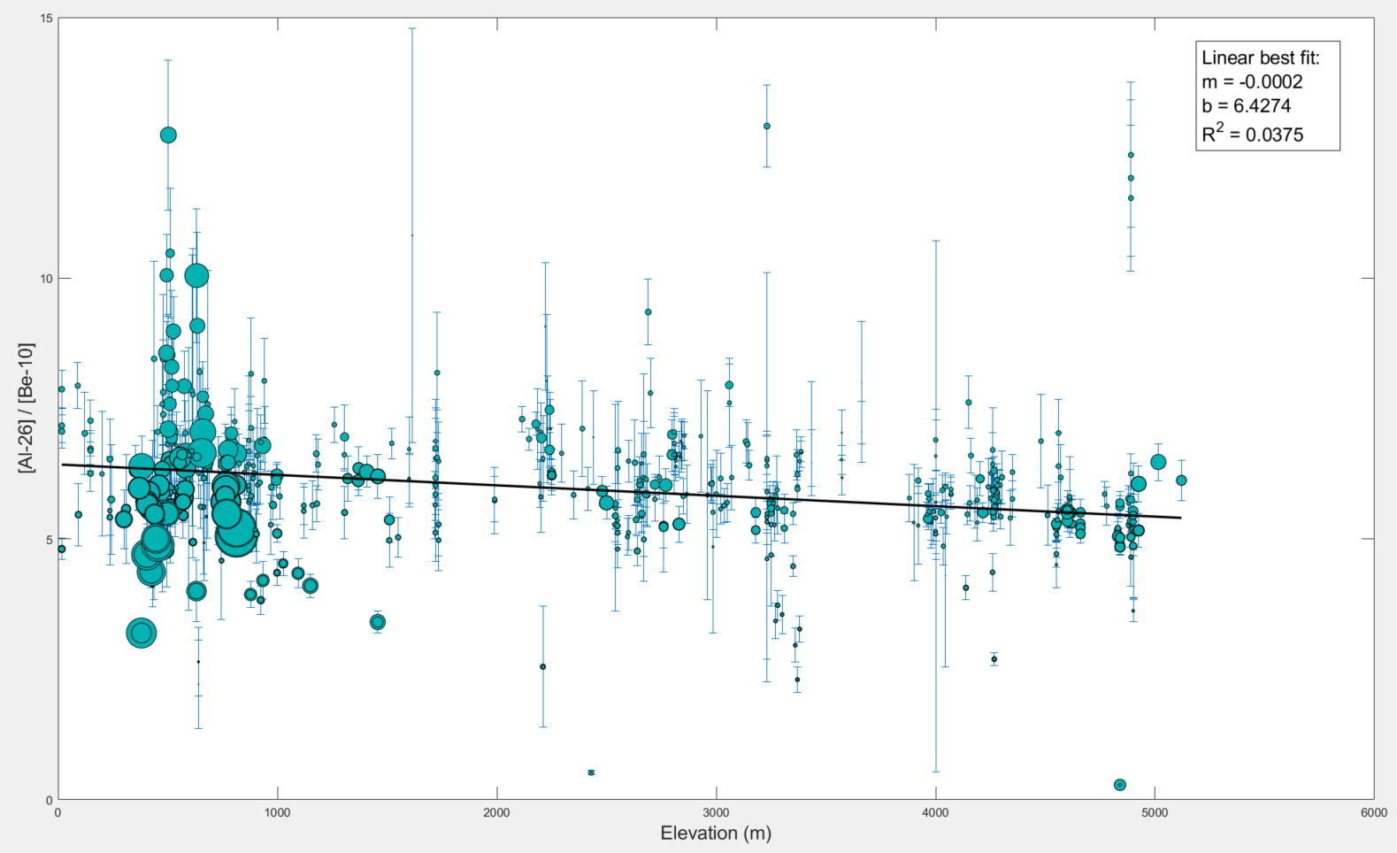
please find a script that you can copy into a new script editor written to produce this plot here.
% comparing the Al-Be ratio of all samples in the ICE-D alpine database
% against elevation to determine if there is an influence on the production
% and ratio of these two comsmogenic isotopes with elevation.

% clear out all pre-existing variables and windows to start fresh
clear all; close all;

% as always, one must first connect to ICE-D.
% Before running the script, be sure that you are connected to ICE-D in
% Heidi SQL!
% The script for connecting from a windows OS is as follows,
% assuming you set up an ODBC connection:

dbc = database('ICED-ALPINE','reader','beryllium-10');

% here is some code from Greg Balco for connecting to the database from a
% Mac computer. I have no idea if it actually works but here it is for
% y'all.

% Get Sequel Pro running and use
% the below to find the SSH tunnel port.

%[sys1,sys2] = system('ps aux | grep 3306');
%portindex = strfind(sys2,':173.194.241.211:');
%portstr = sys2((portindex(1)-5):(portindex(1)-1));


%%%%%%%%%%%%%%%%%%%%%%%%%%%%%%%%%%%%%%%%%%%%%%%%%%%%%%%%%%%%%%%%%%%%%%%%

% Once connected to ICE-D, we want to extract ALL samples from the database
% that have both Be-10 and Al-26 measurements and plot sample ratios
% against elevation.
% here is an SQL query formatted in matlab to extract all samples and
% format the sample names, Be-10 concentrations and errors, Al-26 concentrations
% and errors, sample elevations, and Be-10 exposure ages (to use for
% dictating marker size).

q1 = ['select samples.sample_name, samples.elv_m, Be10_Al26_quartz.N10_atoms_g, Be10_Al26_quartz.delN10_atoms_g, Be10_Al26_quartz.N26_atoms_g, '...
' Be10_Al26_quartz.delN26_atoms_g, calculated_ages.t_LSDn '...
' from samples, Be10_Al26_quartz, calculated_ages '...
' where samples.sample_name = Be10_Al26_quartz.sample_name '...
' and samples.sample_name = calculated_ages.sample_name '...
' and samples.elv_m is not null and Be10_Al26_quartz.N10_atoms_g is not null and Be10_Al26_quartz.N26_atoms_g is not null '...
' and Be10_Al26_quartz.N26_atoms_g > 1000 and Be10_Al26_quartz.N26_atoms_g not like 0 '];

% this will store all data in a table that we can format into cell arrays
% for plotting with the following code:

samples.table = fetch(dbc,q1);
samples.cell_array = table2array(samples.table(:,[2 3 4 5 6 7]));

% ratio errors is the root of the sum of each error divided by its
% concentration measurement and then all of that multiplied by the
% 26Al-10Be ratio.

samples.error = double((samples.cell_array(:,4)./samples.cell_array(:,2)).*(((samples.cell_array(:,3)./samples.cell_array(:,2)).^2)+((samples.cell_array(:,5)./samples.cell_array(:,4)).^2)).^0.5);

%now time to plot it all!

errorbar(samples.cell_array(:,1), (samples.cell_array(:,4)./samples.cell_array(:,2)), samples.error, 'vertical', 'LineStyle','none')
hold on
scatter(samples.cell_array(:,1),...
    (samples.cell_array(:,4)./samples.cell_array(:,2)),...
    'MarkerEdgeColor',[0 0 0], 'MarkerFaceColor', [0 .7 .7], 'SizeData', (samples.cell_array(:,6)./1000),...
    'LineWidth', 0.5)
xlabel('Elevation (m)','FontSize',16)
ylabel('[Al-26] / [Be-10]','FontSize',16)
dim1 = [.8 .9 0 0];
str1 = {['Linear best fit:'], ['m = -0.0002'], ['b = 6.4274'], ...
    ['R^2 = 0.0375']};
annotation('textbox',dim1,'String',str1,'FitBoxToText','on', 'FontSize', 16);
hold on
x1 = samples.cell_array(:,1);
y1=-.0002 * x1 + 6.4274;
plot(x1,y1, "Color", [0 0 0],"LineStyle","-","LineWidth", 2)

%thanks for following along!
7) Heinrich Stadials aridity drives glacier retreat in the Mediterranean? This example is a follow up to a paper recently published in Nature Geoscience (Allard et al., 2021) that found that glaciers in the region may have been retreating during Heinrich Stadials due to more arid conditions.
They compiled many moraine and erratic boulder ages from across the Mediterranean, found intervals of erratic boulder deposition during Heinrich events and suggested this as evidence of retreat during Heinrich Stadials.
This is an example of an easily testable hypothesis using ICE-D: Do moraine ages across the Mediterranean more often lie outside of Heinrich Stadial events while erratic boulder ages more often line up within Heinrich Stadial events when compared to a random distribution of both moraine and erratic boulder ages? If yes, this would support the conclusions put forth in Allard et al., 2021. If no, it may bring into question some of the interpretations made in the paper.
The set up would first be to compare a random distribution of both moraine and erratic boulder ages against a North Atlantic record (such as the NGRIP d18O curve) and see how frequently ages line up with Stadials and warm intervals (ie, what % of the time, from x-x ka, do moraine ages line up with Stadial events? What % of the time do random ages line up with warm intervals? And do the same exercise for erratic boulders). Then, run the same exercise for the actual observed ages from the Mediterranean and compare. Is there actual evidence to suggest that moraine ages occur a higher % of the time within warm intervals compared to a random distribution? Is there evidence to suggest that erratic boulder ages occur a higher % of the time within stadial intervals compared to a random distribution? Who knows? Let's find out.
8) Identifying regions of possible heavy moraine degradation (using the moraine ages and land degradation models incorporated into the middle layer of calculations) and comparing identified areas of high degradation to geohazards (plate boundaries and areas of high seismic activity). Hypothesis: if geohazards actually present a notable obstacle to moraine dating through moraine degradation, then we should be able to find instances of high moraine degradation coinciding with high seismic activity.